
如何在PPT中制作图表
2023-06-11 03:12:43|作者:ppt教程
 如何在PPT中制作图表?当遇到很多数据需要分析重要的、一般的、次要的时候,这个使用就要利用图表功能进行制作,通过图表的方式,可以一目了然的看到什么是重点的。那么ppt图表怎么做呢?1.首先确定想要插入图表的页面,其次在页面中会显示图表的标示,如果页面没有图表的标示时的可以在表头上面点击插入—图表
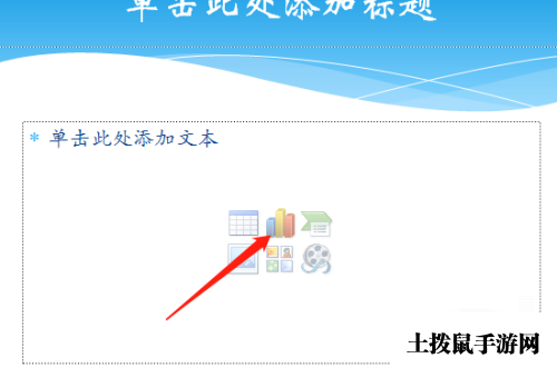
2.点击图表后选择图表的类型,柱形图、线形图,各种图形,主要根据实际的情况进行选择,突出重点的部分一二三的 可以选择柱形图

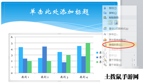
3.插入图表后,鼠标点击图表然后鼠标点击右键,会出现很多的选项,这个时候点击“编辑数据”将想要填入的数据准备号
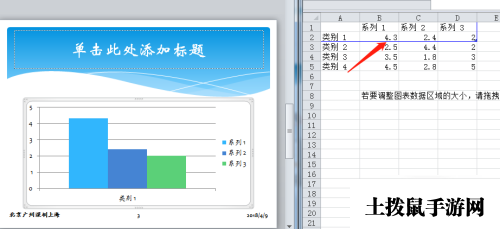
4.接着讲想要体现的数据,分门别类,右图蓝色线框可以自由调整,数据可以增加行、列,数据必须在蓝色线框内,将数据填好后直接关闭
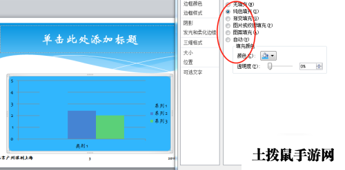
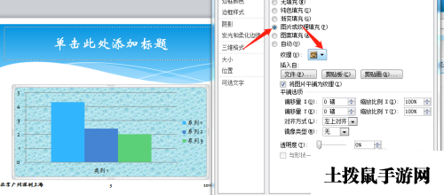
5.接下来是给图表换底色,点击图标右击,选择“设置图表区域格式”,可自由选择有色填充或更改其他的颜色填充,也可以选择系统自然的底色图片
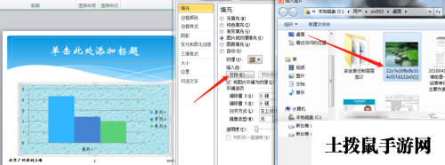
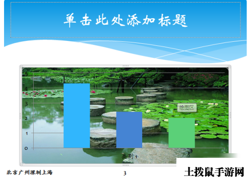
6.如果觉得图片不适合时,可以将自己的觉得比较好的图片插入到图标当中去,按照上面的步骤选择“图片或者纹理填充”在点击“插入自—文件”将想要的图片的插入
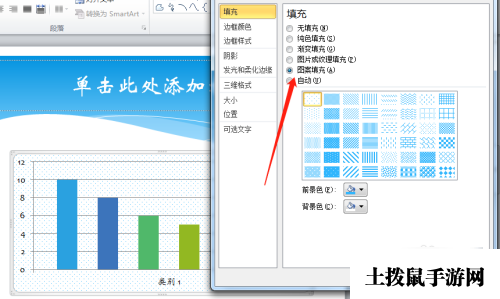
7.也可以右击选择“设置图片区域格式”“图案填充方式”星星、点点、条纹的选择,下方可是可以自由的选择对称的颜色
.diggit { display: block; width: 160px; margin: 20px auto; background: #ff5501; color: #fff; box-shadow: 1px 2px 6px 0px rgba(0,0,0,.2); border-radius: 3px; line-height: 40px; text-align: center; } .diggit a { color: #fff }